Avinode’s Design System
Building and scaling a design system
Building and scaling a design system
Creating a simple yet impactful design system
My Responsbilities
As a member of the design team at Avinode, I worked to create a design system for all of us designers to use across the different product offerings.Defining Standards and Patterns: Established guidelines for component usage, interaction patterns, accessibility to create a cohesive, user-centered design language.
Collaborating Across Teams: Worked closely with developers and other designers to ensure alignment on requirements, feasibility, and implementation of the design system within products.
Documentation: Created clear, accessible documentation that details component functionality, usage scenarios, and best practices to help all teams easily adopt and apply the system.
Designed Reusable Components: Created flexible, scalable UI components that meet diverse product needs while maintaining consistency and adherence to established design principles.
UX/UI Methodologies & Techniques:
- Specific component UX research
- UI design
- QA of implementation
- Style Guide
- Pattern library
- UI Inventory
- UX Audit
Problem at Hand
Avinode’s suite of interconnected products requires a seamless and consistent user experience across each platform. With an expanding design team, it became crucial to enhance and fully document our component library to support a unified design approach and streamline collaboration.
Although some components were previously documented, they lacked the level of detail necessary to ensure alignment and efficiency, making an improved design system essential for our growing team and complex product ecosystem.
The Approach
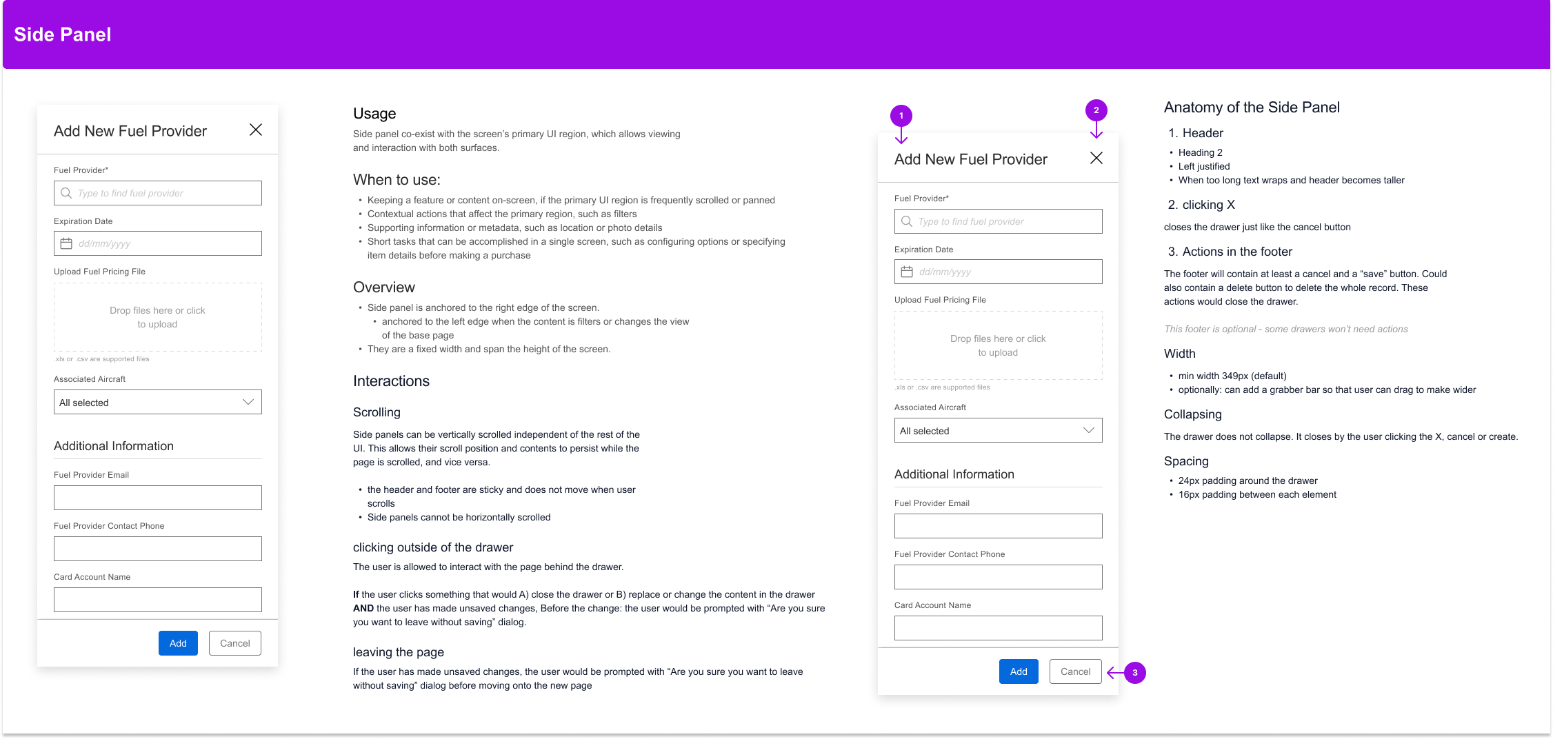
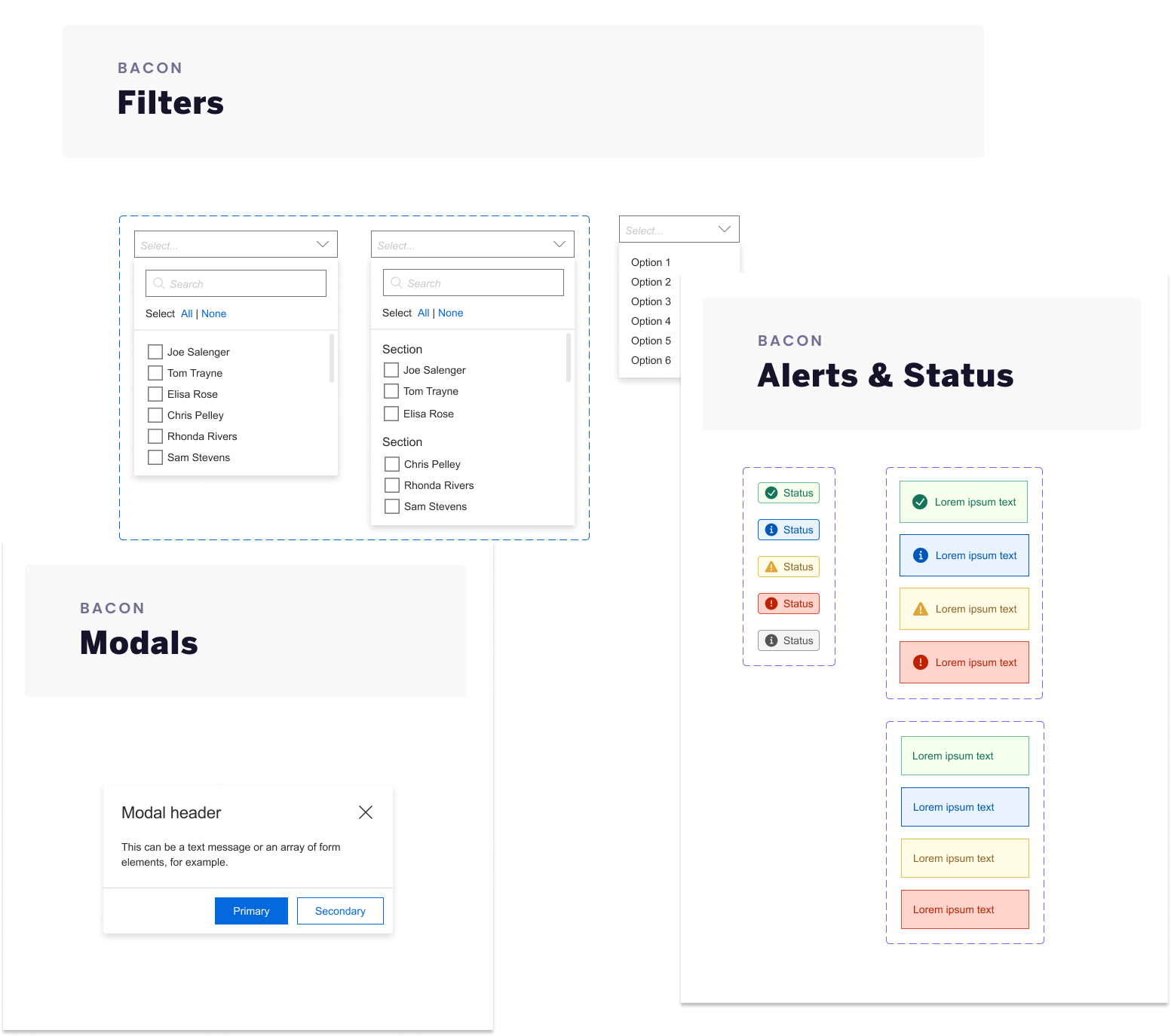
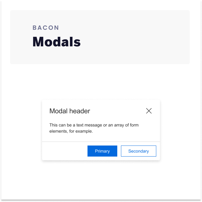
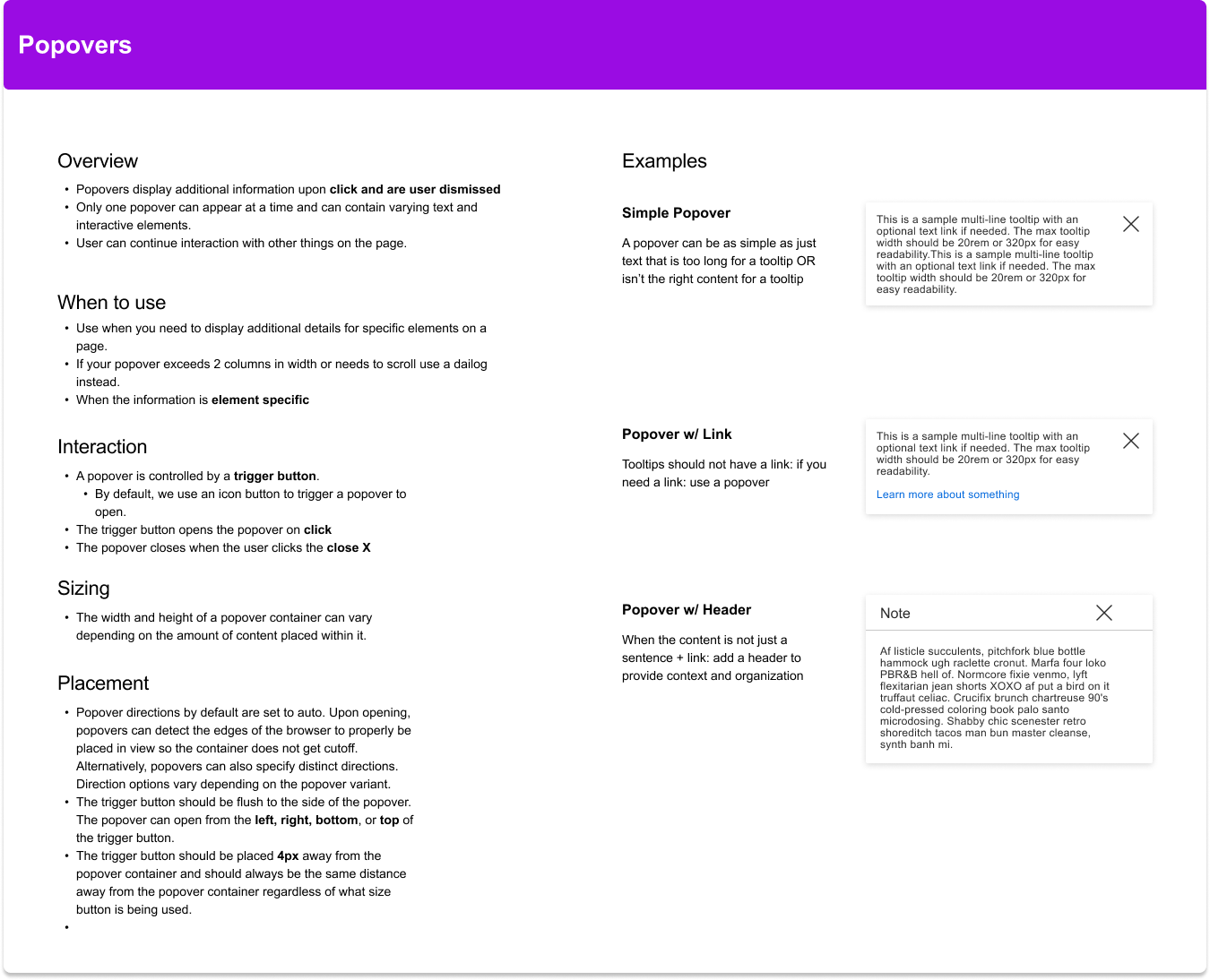
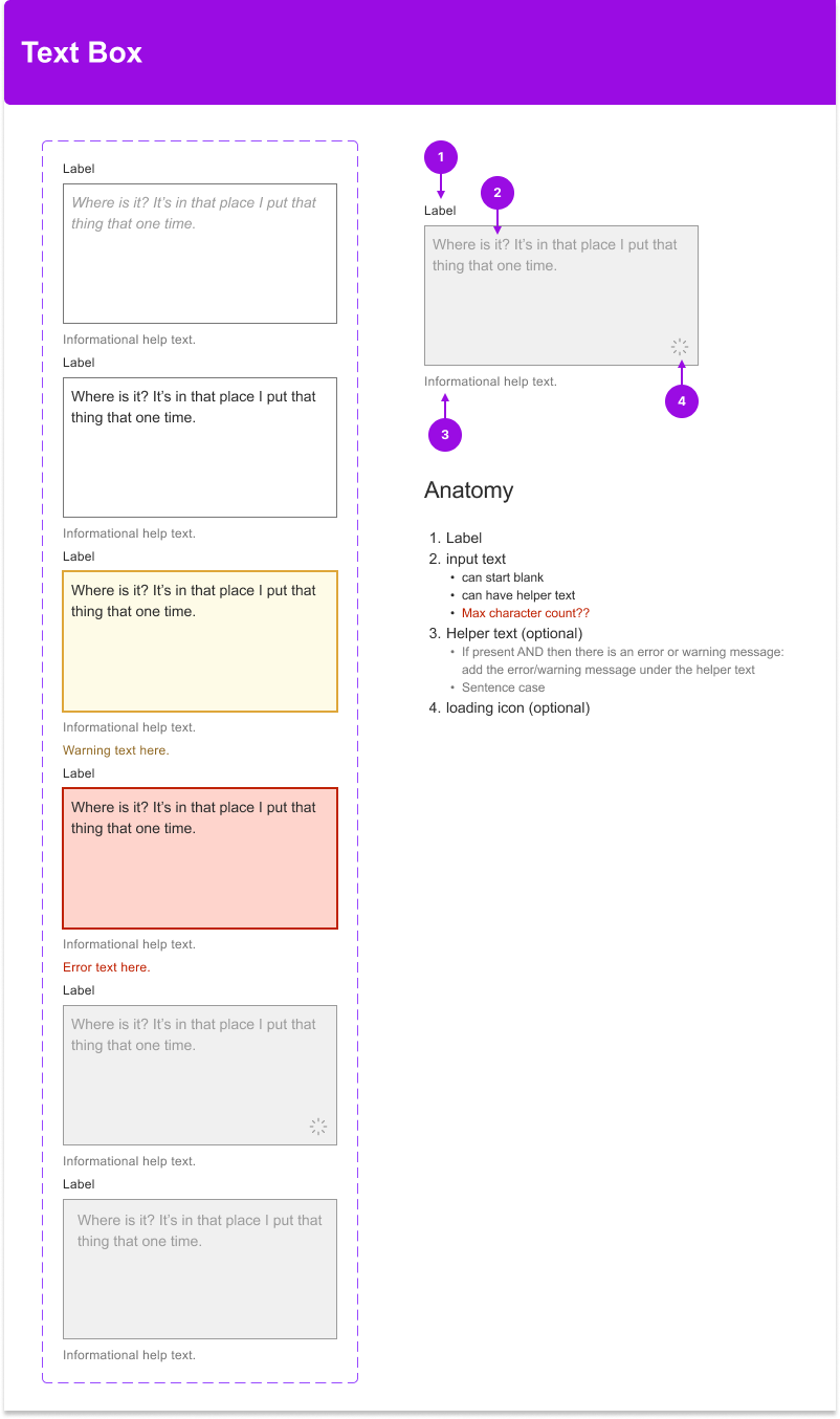
I began by enhancing documentation for existing components in Figma, updating them to accurately reflect the versions currently in production.The documentation was always included on the same page as the component this was to explain any use cases that were created. This consisted of:
- A clear explanation for what this element is and how it is typically used, occasionally accompanied by dos and don’ts for context and clarification.
- Examples so that it was clear what we were talking about
- Rules of when to use the component and how to use the component
Old
︎︎︎
New
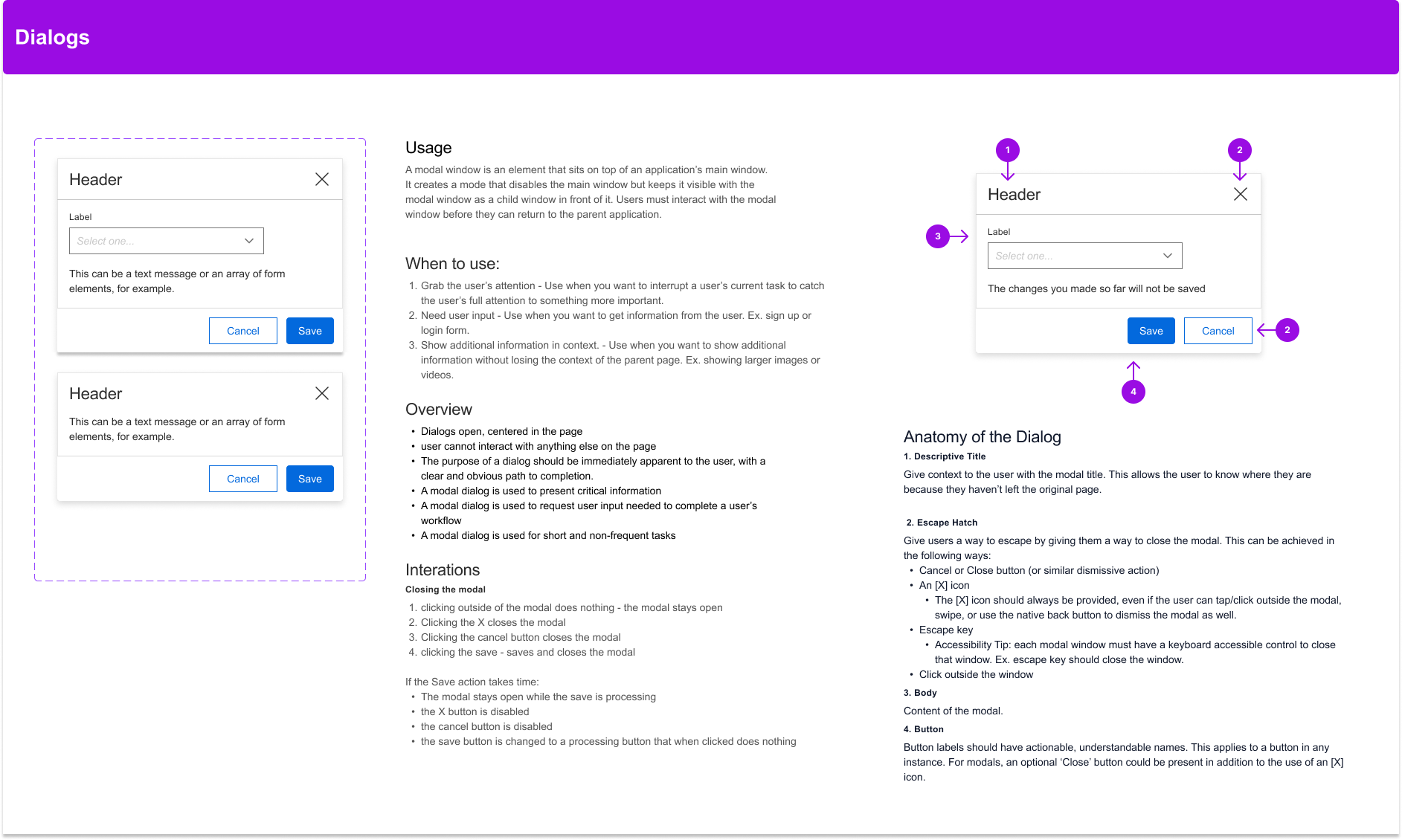
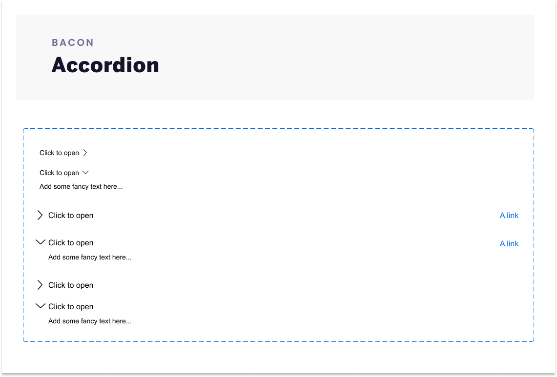
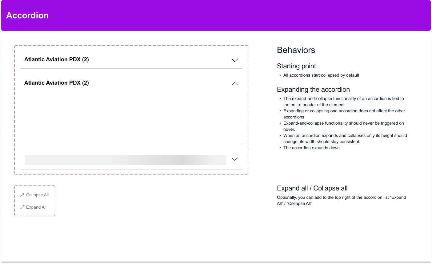
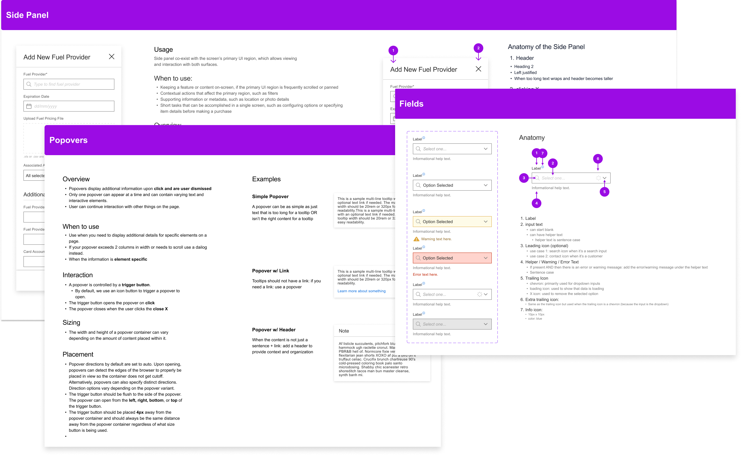
Then I created documentation for missing components
Tooltips
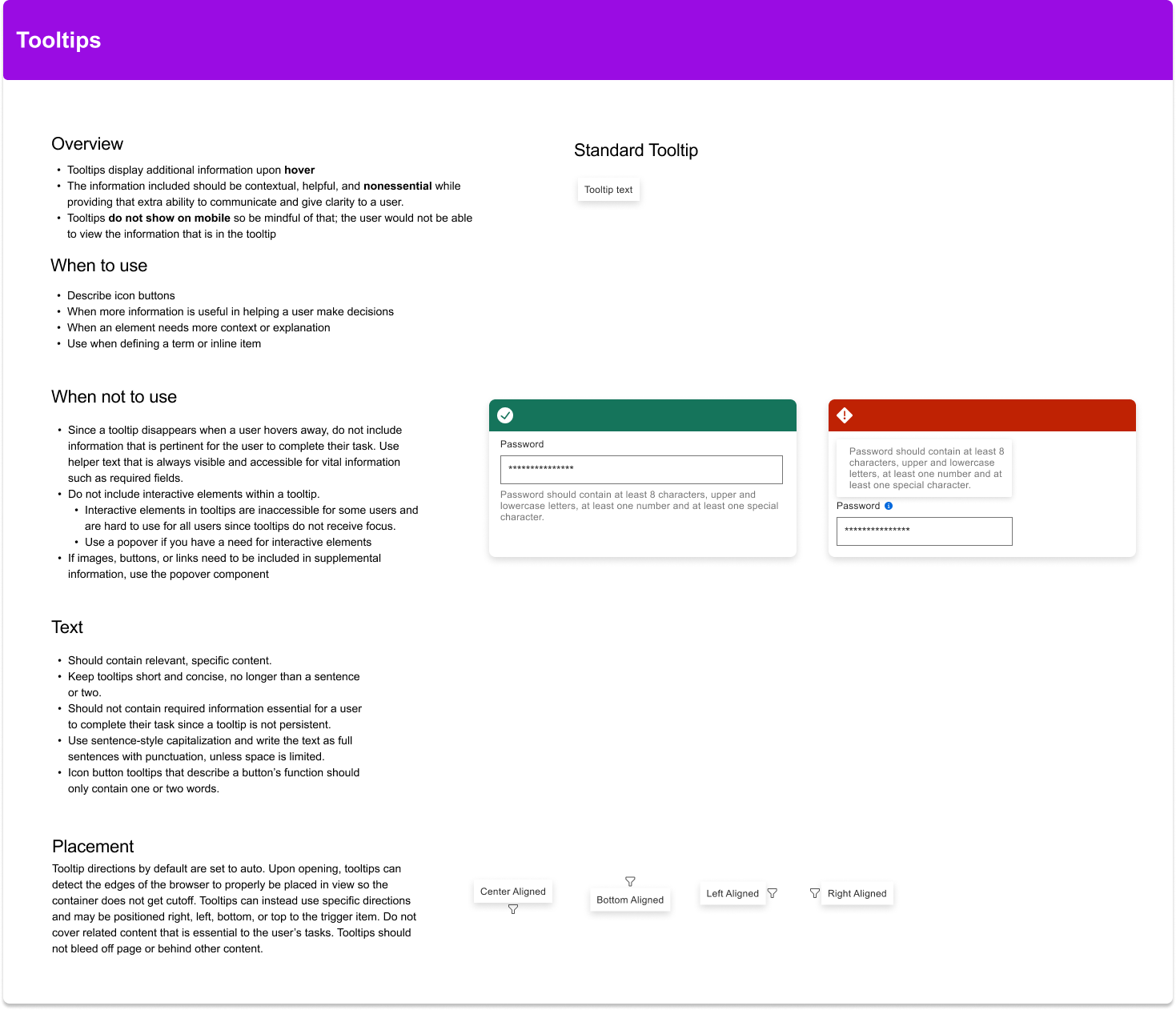
Popovers
Text Box
Input Field

Side Panel
