Creating Goldstar’s
Discovery Home Page

The Challenge
- It is not clear that Goldstar is about finding things to do
-
We have no home page today and instead a login or signup "wall"
-
We do not have a good UX experience for new or unengaged users
Guiding Principles
- Let users know what questions we can answer about their going out needs
-
We should answer their questions as easily as possible
- Encourage discovery
My RoleLead the content strategy by focusing on what the UX should be for a first time users and a user who views the page daily. Ran user testing on new layout and new IA flows.
3.5k
Daily Active Android Users
6.8k
Daily Active iOS Users2,455
Daily New Members
Overview
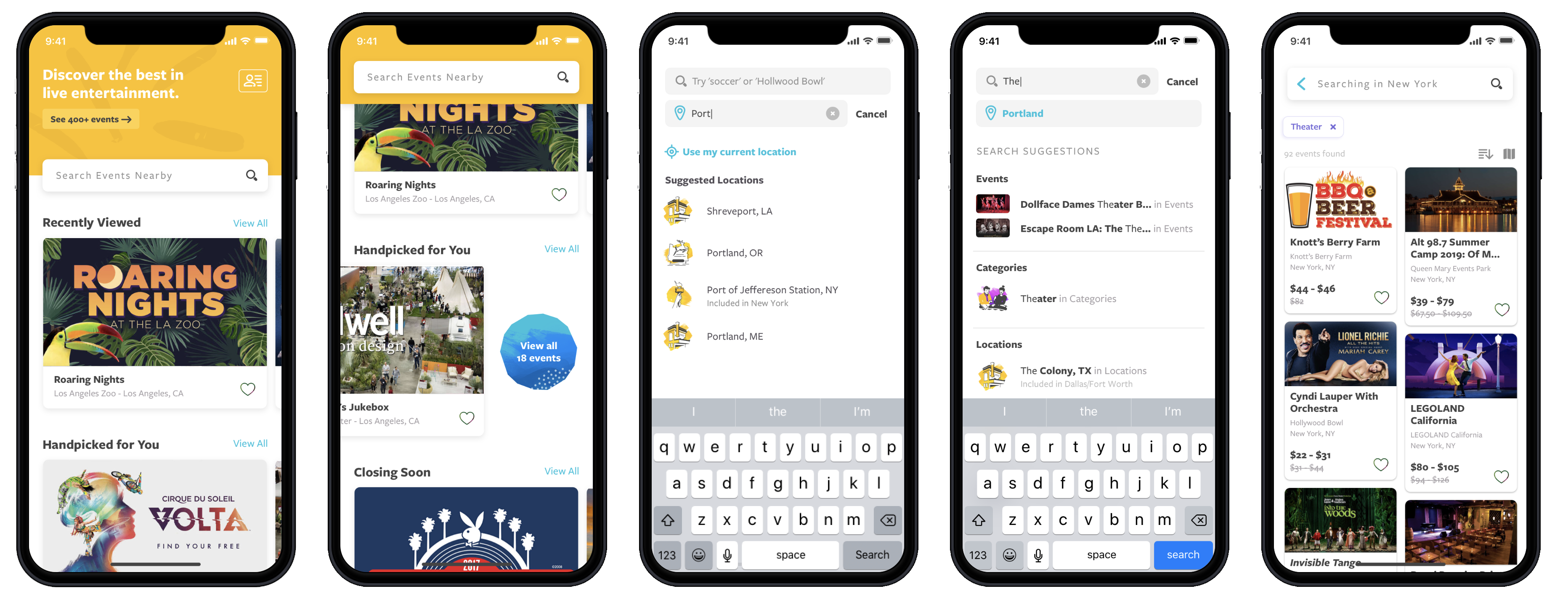
Our goal for the home screen is to always provide fresh content for our users to keep them returning to the app. When they arrive, we want to entice them to keep scrolling via personalized and interesting groupings of events.
We’re grouping our homepage content into “buckets”: side-scrolling groups of events that change often depending upon the user’s preferences and the season/month/day of the week.
Our buckets fit broadly into three types: Personalized, Location-based, and Exploration. The content pyramids below illustrate how we expect the proportion of these types to change for various use cases.


Content Scrolling Pyramid
As the user scrolls through the home page the event buckets they will see go from personalized to general.
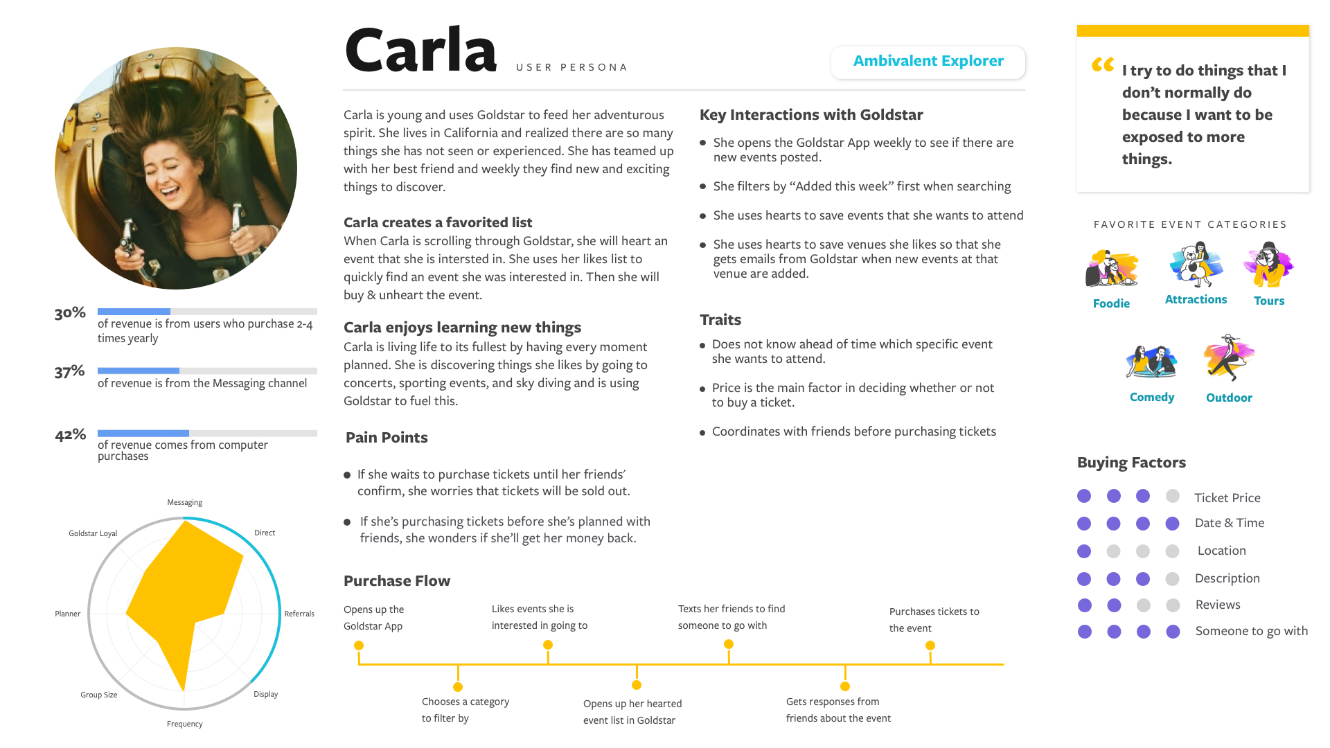
For Carla members, the highly personalized buckets will take up most of what she scrolls through and only at the very bottom will see find more general event buckets.
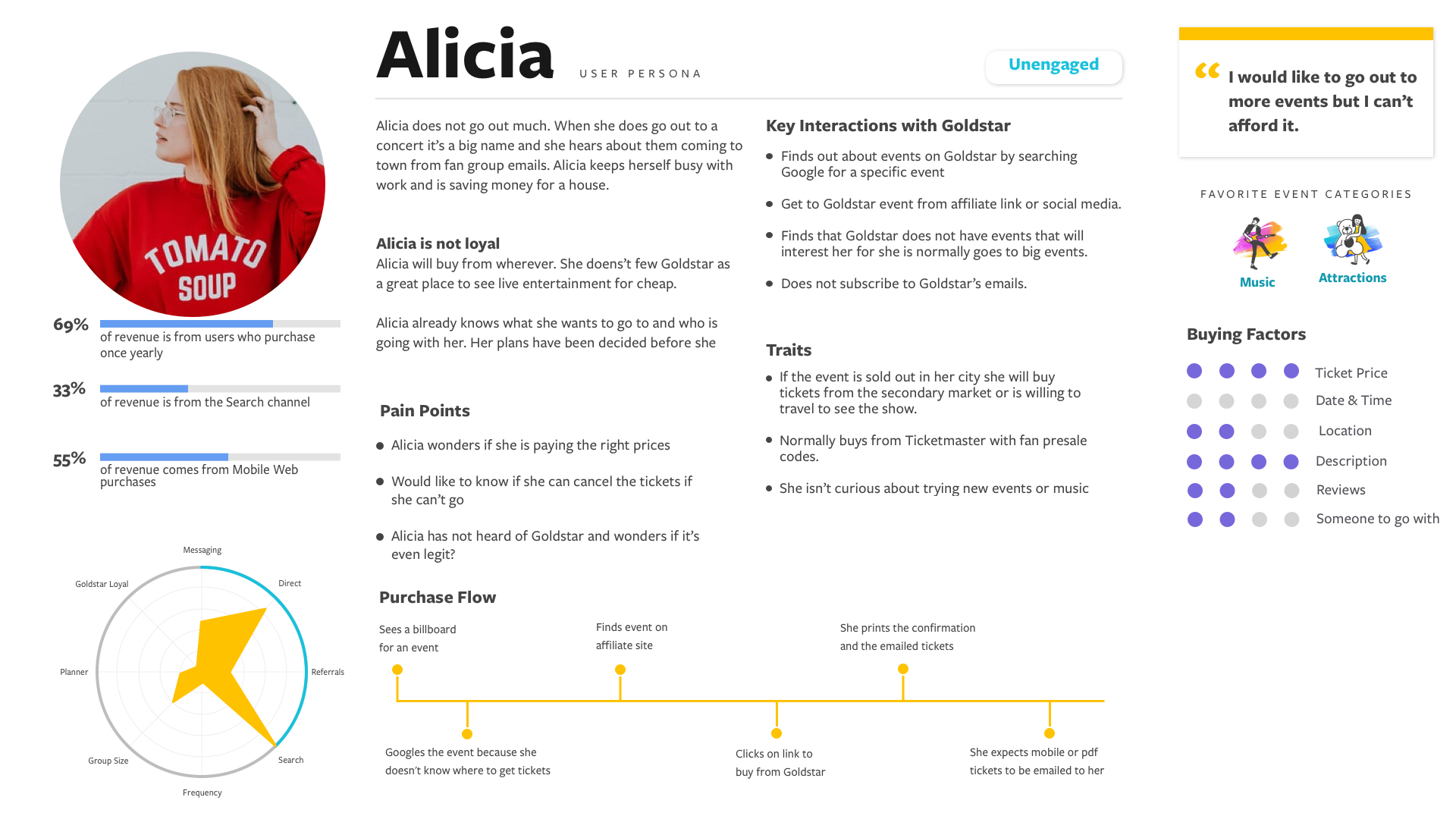
Because we know less about Alicia, it's more likely that her personalized buckets won't hit the threshold and will be hidden. So Alicia's homepage will result in more location-based recommendations.


Where do users expect to find their purchased tickets?
Hypothesis: We should have purchased tickets as a menu item outside of the account menu item. Using common icons for tickets and accouont will help user know where to find content.
User Research Results: 8 testers in version A went to Account first before redirecting to the Your Tickets icon. In the next test we decided to add Your Tickets to the Account menu as well. 5 out of the 25 testers went to the Account menu for their tickets in version B. We concluded that there did not need to be a seperate menu icon for purcahsed tickets for users expected it to be in their account and went there first.

Can users find how to add content filters?
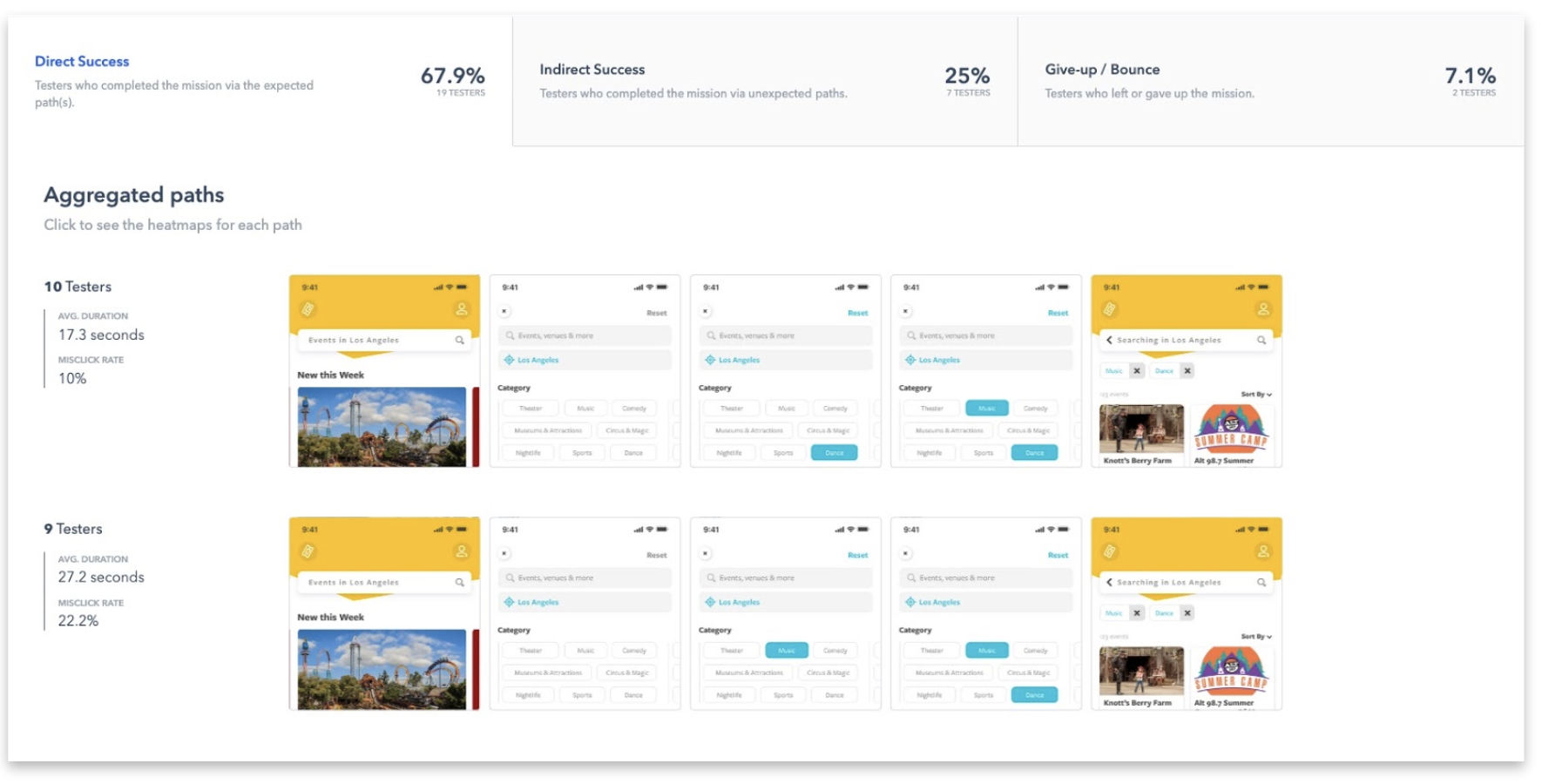
Concerns: We had a few extra concerns around 1.b so we extended the test to ask about finding where filters live, and about getting back to the initial home screen.
User Research Results: Testers had lots of issues figuring out how to find filters. Once they were in they generally did fine, but finding Filters was problematic.