Responsive Menu
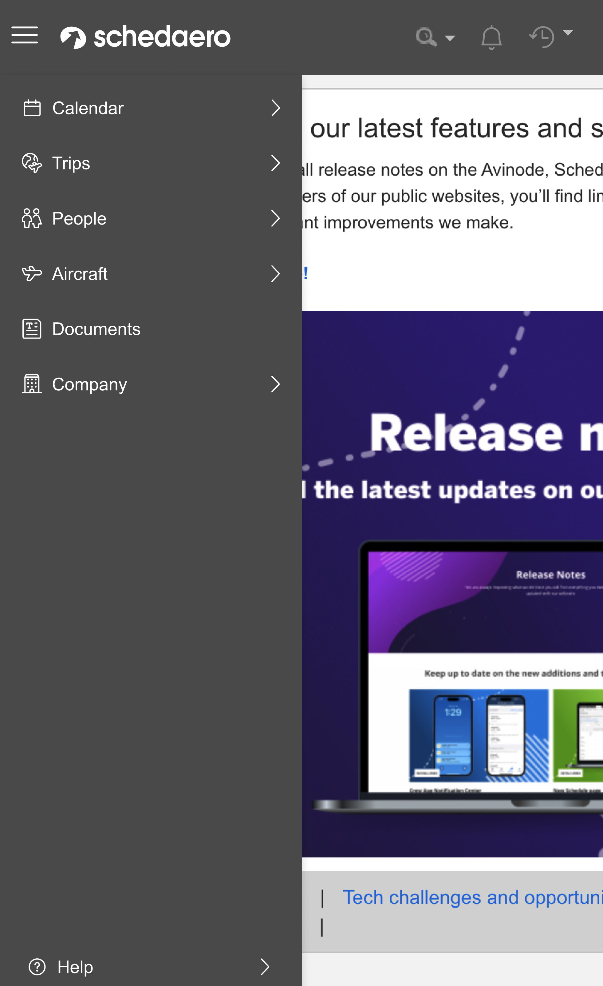
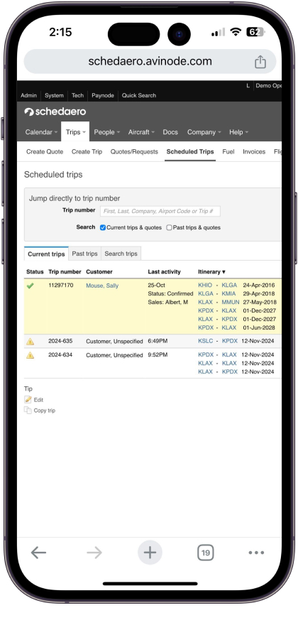
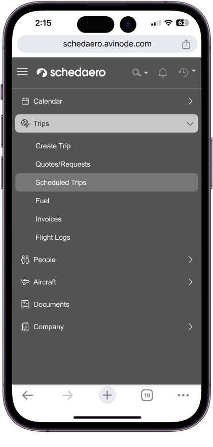
Users are using Schedaero on the go but our menu is not responsive making the application hard to use.
Current
![]()
New
![]()
Current
New
My Role
Focusing on crafting a delightful experience that make people's lives easier: I lead and pitched the idea for making a new menu that would be easier to use on customer’s mobile phone.My ProcessWorking with the close-knit collaborative design group, I guided this design process using a highly iterative user-centered design process. I combined research, data, and thoughtful critique into finalizing the designs for this new menu.
Decisions to be made...
How will the menu levels work?
I created prototypes of different ways the user can interact with expanding menu options to see their child pages.
I created prototypes of different ways the user can interact with expanding menu options to see their child pages.
Option 1:Do we want to have the menu expand down like a content tree
Option 2: Do we want to have the next level replace on top of the previous level?
Option 3: Do we want to have the have the menu flyout?

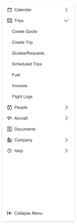


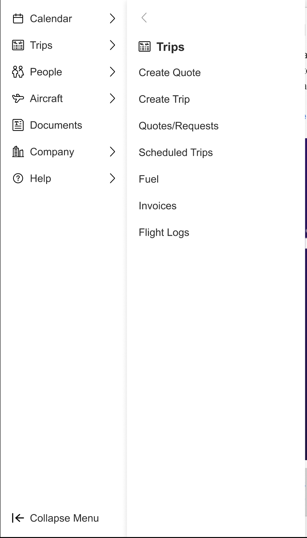
Will the menu always show?
Having an always-visible menu (persistent navigation) on a website can impact user experience in various ways, and there are both advantages and disadvantages to consider:Pros of Always-Visible Menu
- Improved Accessibility: Users can easily access any part of the site without needing additional clicks. This is helpful for larger, content-rich sites like Avinode where quick navigation is important.
- Enhanced Discoverability: A visible menu ensures users are aware of the available sections. But our users will quickly become power users...
Cons of Always-Visible Menu
- Screen Real Estate: Especially on mobile or smaller screens, a persistent menu can take up valuable space that could be used for content.
- Visual Complexity: Constantly showing the menu can be distracting, drawing focus away from the content users are trying to engage with. This can especially be an on our heavy content pages.
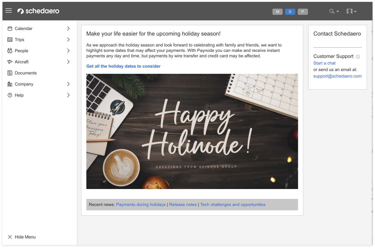
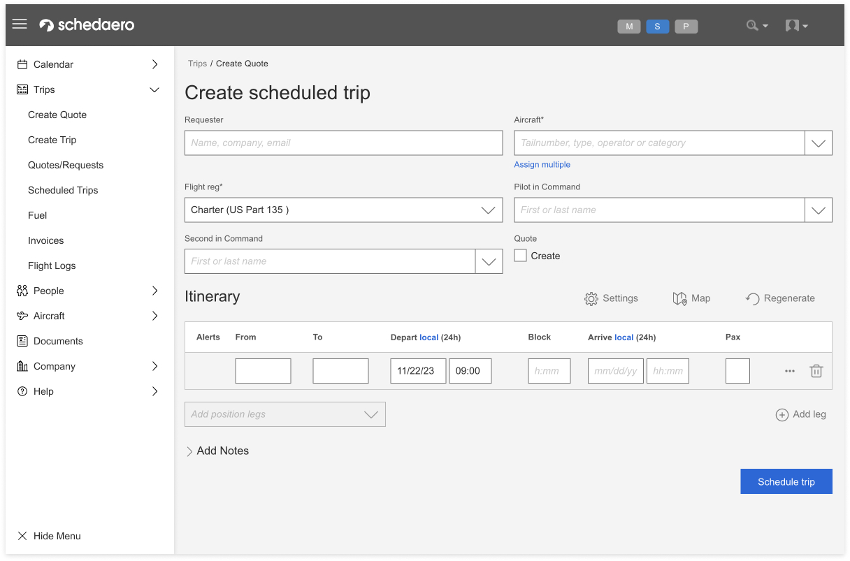
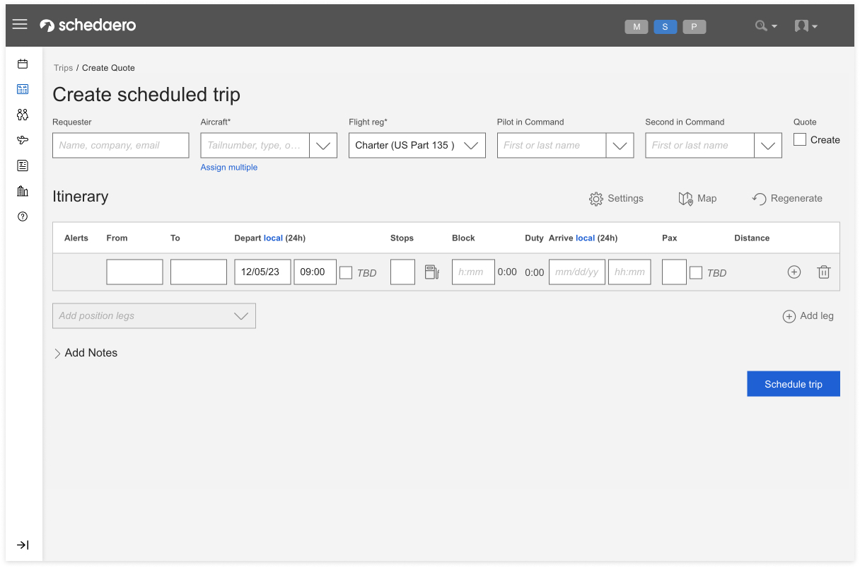
As a team, we balanced these pros and cons considering the user’s need to quicly jump between pages and their desire to use Avinode on their mobile device. We landed on a collapsible or "hamburger" menu to improve usability by maximizing content space.
4. Application Switcher
Creating an effective application switcher requires a design that is intuitive, efficient, and fits seamlessly into the user's workflow. Goal is to allow users the ability to switch between Avinode’s applications. How can we incorporate this into the menu or header?
4. Application Switcher
Creating an effective application switcher requires a design that is intuitive, efficient, and fits seamlessly into the user's workflow. Goal is to allow users the ability to switch between Avinode’s applications. How can we incorporate this into the menu or header?
Option 1:
Add the application switcher to the top of the menu
Add the application switcher to the top of the menu
Option 2:
Add the application switcher to the top navigation.
Add the application switcher to the top navigation.
Option 3:
Add the application switcher to the top navigation that highlights what application they are in.
Add the application switcher to the top navigation that highlights what application they are in.


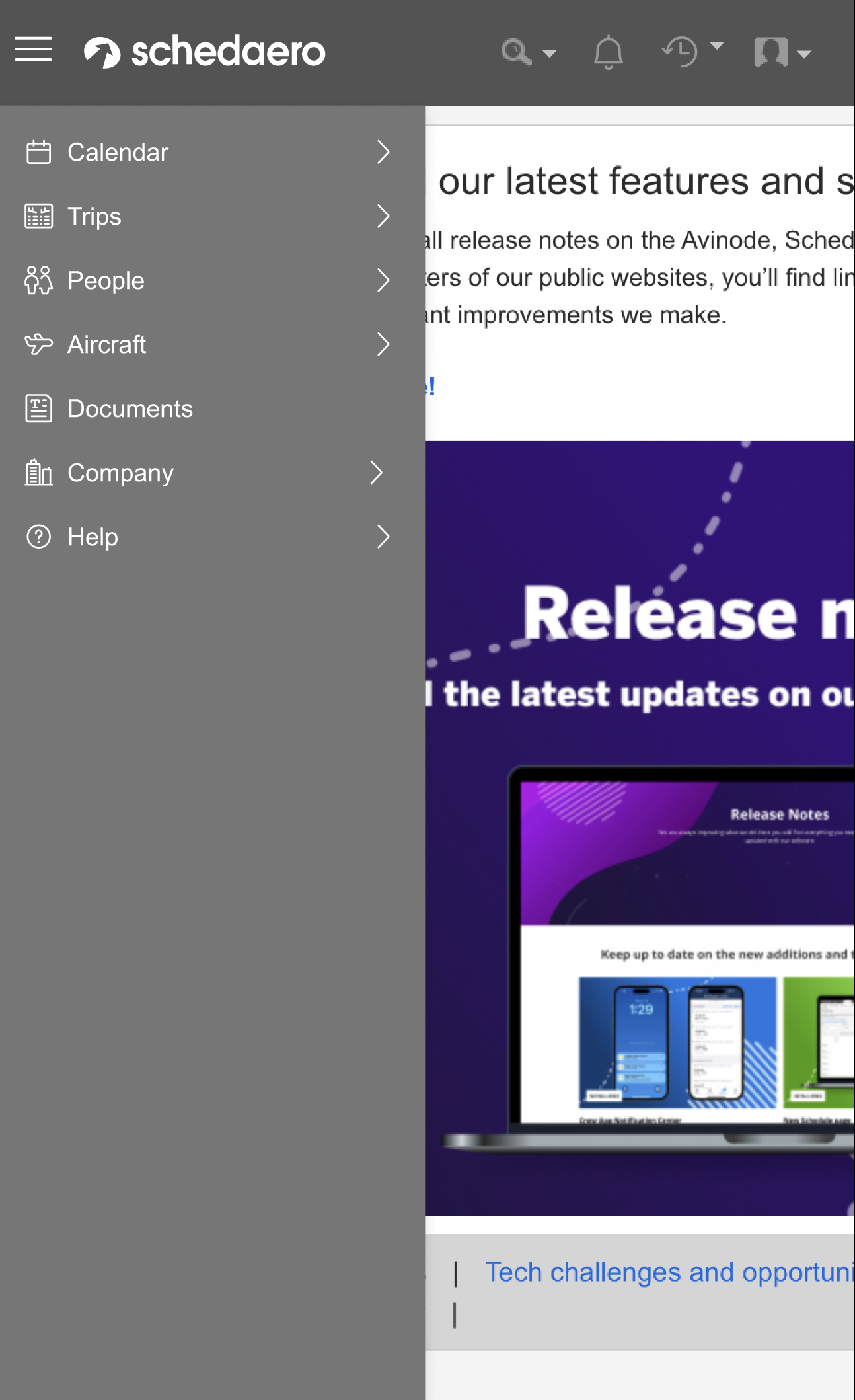
4. Menu Color
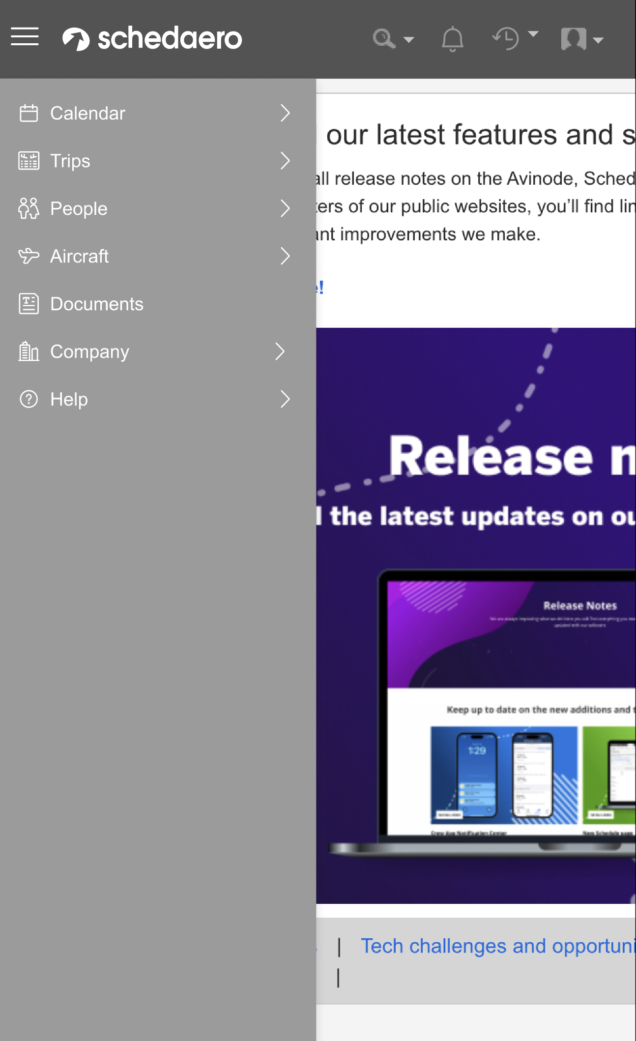
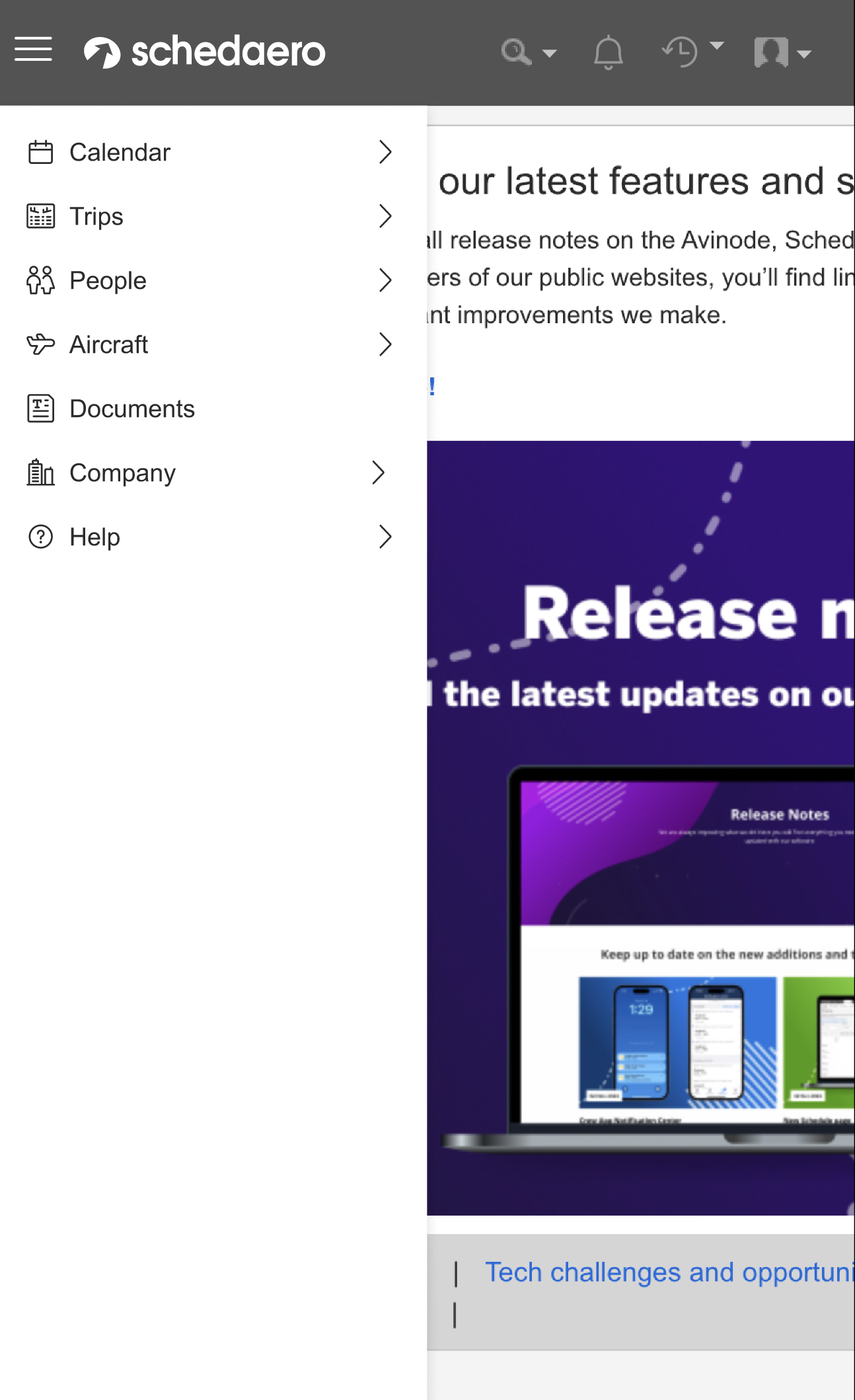
Selecting a menu color that complements our header bar color involved balancing visual harmony, contrast, and usability. The current header is dark gray so I explored different menu options that would work with that. The Avinode design library had a lot of different shades of gray to explore.
Selecting a menu color that complements our header bar color involved balancing visual harmony, contrast, and usability. The current header is dark gray so I explored different menu options that would work with that. The Avinode design library had a lot of different shades of gray to explore.
Option 1:
Darkest Gray and match the header
Darkest Gray and match the header
Option 2:
What if the gray was a bit ligher than the header?
What if the gray was a bit ligher than the header?
Option 3:
What if we went even lighter? ... but this one made the menu feel disabled
What if we went even lighter? ... but this one made the menu feel disabled
Option 4:
What if we went another direction and went white? ... but this felt disconnected to the header.
What if we went another direction and went white? ... but this felt disconnected to the header.

5. Selected and hover statesCreating effective hover and selected states for a menu improves user navigation and provides clear feedback.
Explored a background color change that would ensure sufficient contrast
Explored a background color change that would ensure sufficient contrast
- Hover State: Maked sure the hover state is distinct from both the default and selected states. Achieved through a subtle color change
- Selected State: Used a color with high enough contrast that it remains clear when another item is hovered. This state should clearly indicate an active or "currently viewed" item.
